Contact Info

Contact Info

A Finished Home- Design that is Personalized

For a house to feel like a home...Being decorated & "finished" is a big part of it, but when it feels cozy, warm, & like your own personal space for your family- that is when it is truly home. 
Personal photos, mementos, & unique pieces that are treasured along with decor & pillows & accessories all work together to fill a space. Sometimes things feel "too decorated" and more like a furniture showroom or model house than the home where a family lives.  The feeling a room gives when you walk in or sit down is very important in everyday life. 
The things you are surrounded with in your home should "speak to you" 
Typically a master suite should feel calm, soothing, a refuge to retreat to at the end of a long day, and a refreshing space to start your morning. 
A piece of art hung in your entry can be a bright fun piece that says "welcome" or a family portrait that says "this is who we are." 
Don't neglect those things when making selections or finalizing rooms. I try to work one on one with clients to really be in tune to the overall feel and the practicality of a room, furniture pieces, artwork, etc. And a lot of times a space isn't totally finished for a while. Sometimes it takes a while to find just the right piece or it takes living in a house for a couple months to decide how the family uses the room to determine if a sofa or individual chairs might be a better fit & what works best for the family. 
Kids rooms can be so fun, but often challenging- they change & grow so quickly and finding what they love & are comfortable with now, but can grow with them for a while can pose a challenge. Although sometimes changing one piece of art or a couple of pillows can update the room just enough over several years. 

Gooooooooo DAWGS!

What a fun project and awesome opportunity to be able to update one of the SkySuites at the UGA stadium!  It was a little bit of a challenge setting up times during the off season leading up to this fall football season, but so cool to be there when they're testing speakers, painting lines on the field and running around to get ready for the Dawgs to play! 
Before the box was very drab, plain and lacking personality... They all come "standard" this way. (BORRING) Soooo, when asked to do "whatever you think to make it look great!" I was excited and up for the challenge.  The old love seat had to go & the hunt was on for a red leather loveseat, new coffee table that wouldn't be too large, or take away from anything else, a rug to anchor the seating area, a cool light fixture, foyer table, and accent pieces to jazz it up!  Not to mention repainting all the walls in the suite, adding some accents of decorative painting and re-hanging the artwork and new TV. 
It turned out so great and is a "showstopper" when you walk down the hall and "peek into" the suites!  Many compliments while I was there working on various occasions and at the first game of the season.  So much fun and so rewarding to get to enjoy a space of someone else's after being the one that transformed it and gave it such personality!
It's Saturday in Athens...Gooooooo Dawgs!


BOLD pattern for a dramatic entry

Check out this gorgeous floor! 
I'll have to admit- when this client came to me asking me to paint the wood floors in the foyer & hall of her 100+ year old home I was a little hesitant to say the least. But- as with a lot of my projects, I said "absolutely, I'd love to!" And thought to myself "what the heck am I going to do...?!" 
Anyway- fast forward after lots of hours of tedious work- "voila, a masterpiece emerged! 
What an absolutely breathtaking final result! It makes such a statement that ripping it up and putting down marble tile (which was her original plan) would have never made. This is so much more unique & has such style. 
A classic pattern in timeless black & white. 


Balancing Act

When decorating a space of any kind... It is all about balance.  Sometimes an arrangement of items that are symmetrical... a pair of candlesticks, a pair of bookcases, a pair of chairs are preferable. It can give a more formal feel & is sometimes the safe route when setting up your dining room table for the holidays, or arranging furniture in your great room. 
Otherwise an asymmetrical arrangement that looks balanced is about height, shape, and texture or color.  A lamp may be balanced by books and a framed picture on a console table.  Two smaller thinner containers paired with one piece that has more visual weight to it might work well to decorate a mantle. 
Balancing colors, shapes and sizes when doing any kind of arranging whether it be in a cabinet, on bookshelves, or on a tabletop will make it more visually pleasing.
It is hard for some people to place things well and for a space or room or area to look balanced and well put together without looking like they copied a furniture showroom grouping. 
Sometimes just placing items, arranging what you already have, hanging artwork in a room, and accessorizing bookcases are chores to you but would be a great task left to a designer.

Spring has sprung!

I'm planting a seed- an idea, a thought that you could have a new look.

Now it's up to you to set up a consultation. A fresh, new look could be yours in no time!

Forget spring cleaning... Better yet - spring clean out all those drab, dated décor items you have had for years! Picture a furniture piece with a fun finish, or new artwork to fill blank walls, great pillows on your empty sofa, custom bedding to replace the blah blankets there now, accessories that pop instead of outdated "knick knacks."

Decorate with a purpose

"Don't have anything in your home which you do not know to be useful or believe to be beautiful."
This is a quote I love and it is so true! 
A lot of times we buy things because the color is right, or it works to fill a particular space, which is fine, but you don't want that to be the case with everything in your home.  I like to collect things on travels & find special places for them in my house... I have a beautiful starfish from a trip to Mexico and an abalone shell from another trip then I also have a few small shells & tiny driftwood pieces collected from various beach trips all in our bathroom.  The bathroom doesn't have a "beachy theme" at all, but I love the ocean and how the beach makes me feel- Refreshed, calm & carefree. These few pieces placed in different areas remind me of those trips & memories. 
A collage of pictures from group travels, an heirloom family bible, a great grandparent's old reading glasses- these things make perfect accessories mixed in with books & containers on a bookcase.  The same goes for artwork- a child's craft or coloring sheet is sometimes the perfect piece to have framed and hung on the wall or displayed on a shelf. 
Old cookbooks, collected decorative glass containers, and a personalized cutting board can be function as well as décor in a glass front cabinet in the kitchen.


Color is in full bloom!

Soft, muted colors, or
Crisp, light walls with pops of chroma, or
Bold color on the walls softened by warm finishes around, or
Layered color & pattern in wall finish, window treatment, furnishings. 

Whatever your palette may be- love what it is & embrace the feeling it gives you. 
Color is an incredible thing! 
Don't be afraid of it- whether it is a big helping or small dose.

The Look vs. Function


Pretty and practical don't always go together but they can! It doesn't necessarily have to be a sacrifice whether to have something that is functional vs. something that looks great.
You shouldn't feel like they are two such distant things. Something can be functional in a practical way and still be aesthetically pleasing. 
I tend to be more practical in most spaces than I think people may expect a designer to be. When someone has small children and we are looking at area rugs for their breakfast room I try to think- what will clean up well?... because undoubtedly things will be dropped and spilled. Even an indoor/ outdoor rug might make perfect sense, as long as the color & pattern coordinate well- it can be literally hosed off outside, scrubbed clean & they're usually fairly inexpensive too. So, when those food dropping & spilling babies can be trusted to not make that area into the scene of a food fight, you can get rid of it & get something new and different without feeling bad about spending on a new rug. 
A chair can have great lines and be incredibly good looking, but should have some degree of comfort at the same time. Although- sometimes that perfect accent or statement piece doesn't have to be the "curl up in it & watch a weekend movie" kind of chair either. 
Looking good doesn't have to mean it's not comfy.  And practical doesn't have to be ugly! 
There's definitely a balance and we all know - while stilettos may be beautiful and make you feel sexy, that after an evening in them you may want to throw them in the garbage & soak your feet in a bubbling spa tub. Women joke that beauty is pain (and sometimes it is true!) but in our homes an appealing look doesn't have to mean uncomfortable. You want to look good in those jeans, but be able to walk & breathe in them. If they look great but you can't move in them without feeling like the seam might split then it doesn't make much sense to wear them. After all, if you're going to a favorite restaurant you can't even begin to enjoy your food. So, looking good and feeling good can be a balance of aesthetics and practicality - whether in attire or interior elements. 

Are your windows naked?

Don't get caught with no clothes on your windows . . .

Window treatments are a must -  
Dress those bare windows for goodness sake!
Whether it be panels (a favorite of mine and a timeless classic look- and so many options as far as panels go) or a top treatment... 
Mounted on a board, hung from finials, or a rod with or without rings- there are so many possibilities!
This top treatment in a breakfast room mixes two different fabrics and really adds a custom touch to finish this area off.
These curtain panels are in the great room of the same home.  More of the fabric with color and pattern against a warm, dark wall color is a dramatic statement and adds more style to the windows that are on either side of the fireplace.

(above) In this Master bath update we changed everything in this room, and last but not least was the addition of window treatments.  A dark slate blue embroidered fabric is a pretty contrast against the silver blue on the walls and adds some detail even though it is a simple style.

I absolutely love this!  A girl's bedroom updated - Fun style combining 3 fabrics.  We added lots of color and pattern in this room to really transform it from when it was brother's room!
Before and after
A great room re-designed - bad quality pictures, but shows the addition of color and pattern, some contrast with new granite replacing the white tile on the fireplace, dark finish on mantle and some artwork and accessories.
On any budget, in any room and any style...

Color - Pattern - Texture

Know what to mix & how to.  
When to keep it simple & when you should be bold. 
A bright and vibrant kitchen mixes color, patterns and various textures & finishes for a custom look that "pops."
This palette for a master bedroom is more calm and subtle. 
Serene and peaceful feeling, but still a nice mix of several patterns and soft colors. 

Make the ordinary unique and the boring intriguing

Details; think details... 
Mundane objects transformed into decorative details- keeping the most used items convenient but displaying them in a more appealing way.
Clear glass Apothecary jars filled with cotton balls, q-tips, or soaps are functional accents in a bathroom.
Shown here in my bathroom I have one filled with cotton balls, one filled with sponges and the other contains potpourri and I have mixed in a few shells and rocks found on various beach trips.  They fill this space on the counter, and serve a purpose both in function and aesthetically.
A decorative decanter filled with mouthwash is certainly more attractive than a Listerine bottle on the counter.  

Got pillows...?

If the answer is "no" don't be ashamed, but you better do something about it! 
Pillows are a necessary decorative accent. They add some "soft, squishy," add color and/or pattern, and texture. Just look at the above photo- each pillow has a different pattern but they all work together and add such depth to this area of the room.
Accent pillows can "make the room!" Just like a fantastic scarf or dazzling statement piece of jewelry can make the outfit.
If your ensemble is lacking, then let's jazz it up! 
Master bedroom with custom pillows and bedding- 
pillows that are patterned, solid, and varying sizes mix well together.

 
Before / After  Teenage girl's bedroom with custom bedding and pillows-
Several solids (turquoise textured solid, plum textured solid, fun bright pattern, some funky fringe and two coverlets in different colors)

 
Before / After Girl's bedroom custom bedding and pillows Age:Single 20's  
Solid orange, a dotted brown and orange, and patterned fabrics with creams, orange and brown. Love the mix of textures and patterns here.
 
Basement Mancave sectional sofa with new pillows 
Some in solid contrasting colors and a few with pattern for some pop!

A genuine imitation- the magic of paint

With faux finishes and most decorative painting it's all about . . .

Making something old look new   -or-
Something new look old & worn   -or-
Making a surface look like something it isn't. 

Here are some examples of marbleized columns and the tile that they mimic. 
A soft, beautiful & classic finish.

Exciting News!

I'm very excited to say that Brittany Wallace Interiors is going to have a space in The Antique Market in LaPavillion Shopping Center on the corner of Washington Road and Pleasant Home Road.  
I will be adding more items as available.  Custom Painted furniture pieces, accessories, rugs, pillows, etc.  Home Decor items and custom painted canvases as well!  I am starting with a small space which will certainly grow over time to include more inventory.  To start with- it'll be more of a "taste" of some things I can do and put together. There are lots of great booths and vendors there as well, so definitely check it out and check back often!  
There are open house weekends and great events going on monthly too.

An update all around

This client was so much fun & what started out as just one project in one room, quickly grew and grew. So fun to work from room to room and be able to make a change & watch the home transform.
When you walk in the front door- you are greeted by beautifully textured walls. The finish is a textured finish, with added filigree designs & glazed a butterscotch color to compliment the new paint color we selected in the great room.
Speaking of great room... Along with the new beautiful wide plank wood floors, there is a whole new look for the mantle. The contractor added some trim & "beefed up" the mantle and put new tile up, then I did a painted and glazed finish in a gorgeous green- the prefect touch with the furnishings and decor.
Mantle in great room - Before
After- mantle dressed up, mixed mosaic tile, and green glazed finish with new wall color.

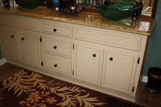
In the kitchen- the finish on the cabinets and new hardware was the final element after the tile floors, granite counters & a tumbled tile backsplash. The creme glazed finish is such a great look with the other finishes in the kitchen.
Down the hall to the guest bath that just had some updating as well with a walk in tiled shower, gorgeous granite and now a wonderful new finish on the cabinet.
Now- keep walking... The master bath was another area where updates had been done & it turned out fantastic! The homeowner found an old claw foot tub & the contractor covered the front with glass mosaic tile- it looks amazing and I was able to update the cabinet finish in this bathroom as well!
How cool does this look...? This master bathroom looks nothing like before- so much character and detail!

I also did a new painted finish on an adorable little accent table. Then added some cute little crystal knobs. 
Such fun and I hope we can work on some more projects in the future!

What a difference some new paint and fabrics can make in a room!

Never underestimate the power of a new paint color!
Plus the new fabrics on window treatments and custom pillows just add so much too! I love mixing colors, pattern and texture to add interest in fabrics.
Blue walls and bold new fabrics as window treatments in this kitchen and breakfast room

Spicy Cinnamon color on the walls and new mix of fabrics on the pillows, chair and window treatments
Love this green dining room with new window treatments that have a band of a contrasting fabric. Perfect compliment to the new walls.  Doesn't even look like the same room as before!
                                    
Bright teal on these kitchen walls and a mix of fabrics on the window treatments. Coordinating fabric on the newly recovered chair cushions.
Custom cushion and pillows made for the mud room bench to compliment the colors and fabrics in the kitchen.